A 30-year financial group that had never spoken to a retail customer. I built their brand and two products from zero.
A&G had decades of B2B financial experience but had never spoken to retail customers. They needed a brand, a marketing website, an investment platform, and a mobile app. My job was to design all of it.
The assumption was that people distrusted fintech. They didn't. They distrusted complexity: jargon, hidden fees, interfaces that assumed financial literacy. That finding shaped every design decision.
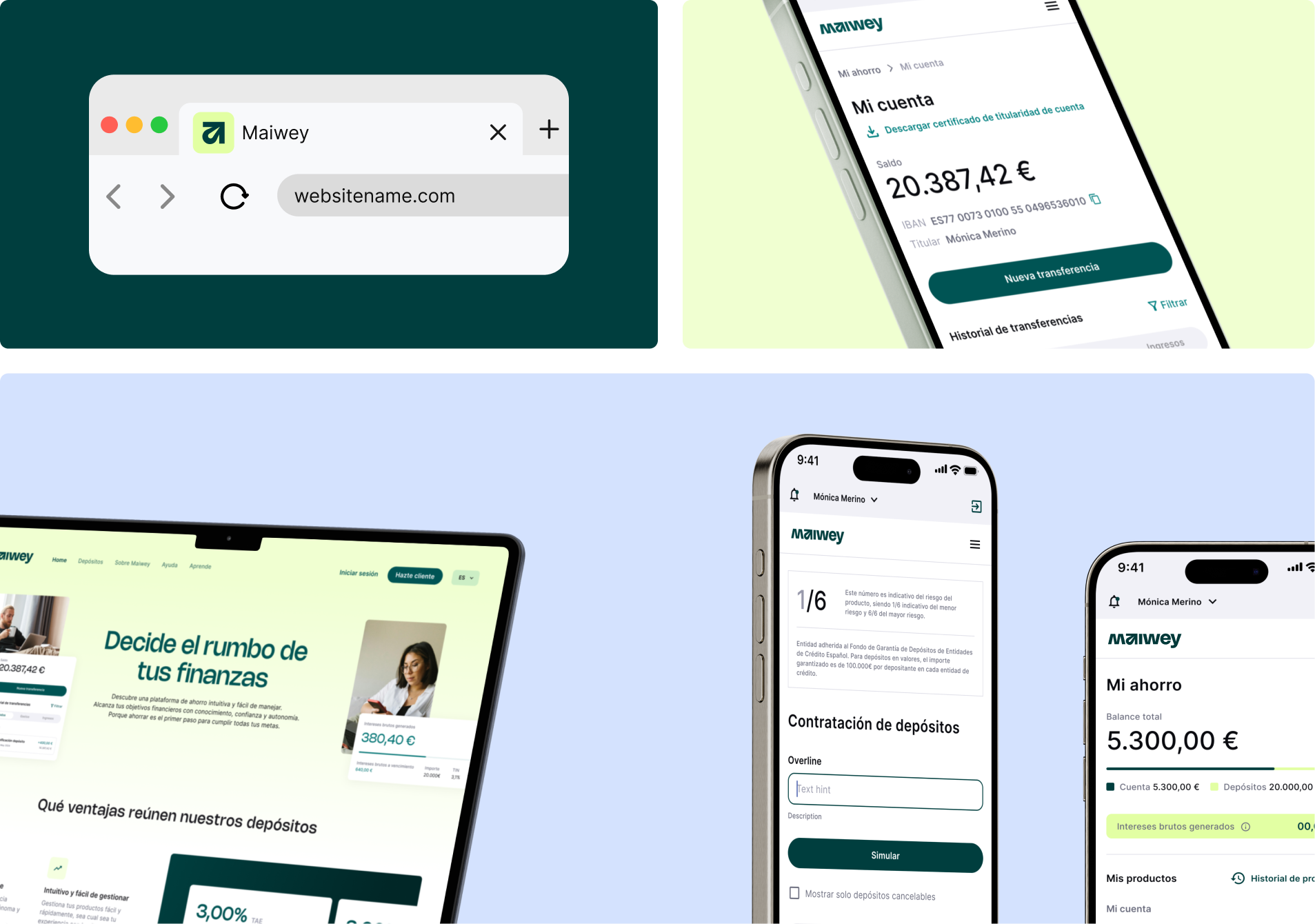
No branches, no ads at launch. The website was the only way in. I put the savings simulator above the fold, before any brand messaging. Users engaged with the calculator before scrolling.
The balance doesn't change day to day. The interest does. Testing showed users kept checking the balance, seeing no change, and disengaging. I flipped the hierarchy, making interest earned the largest element on screen.
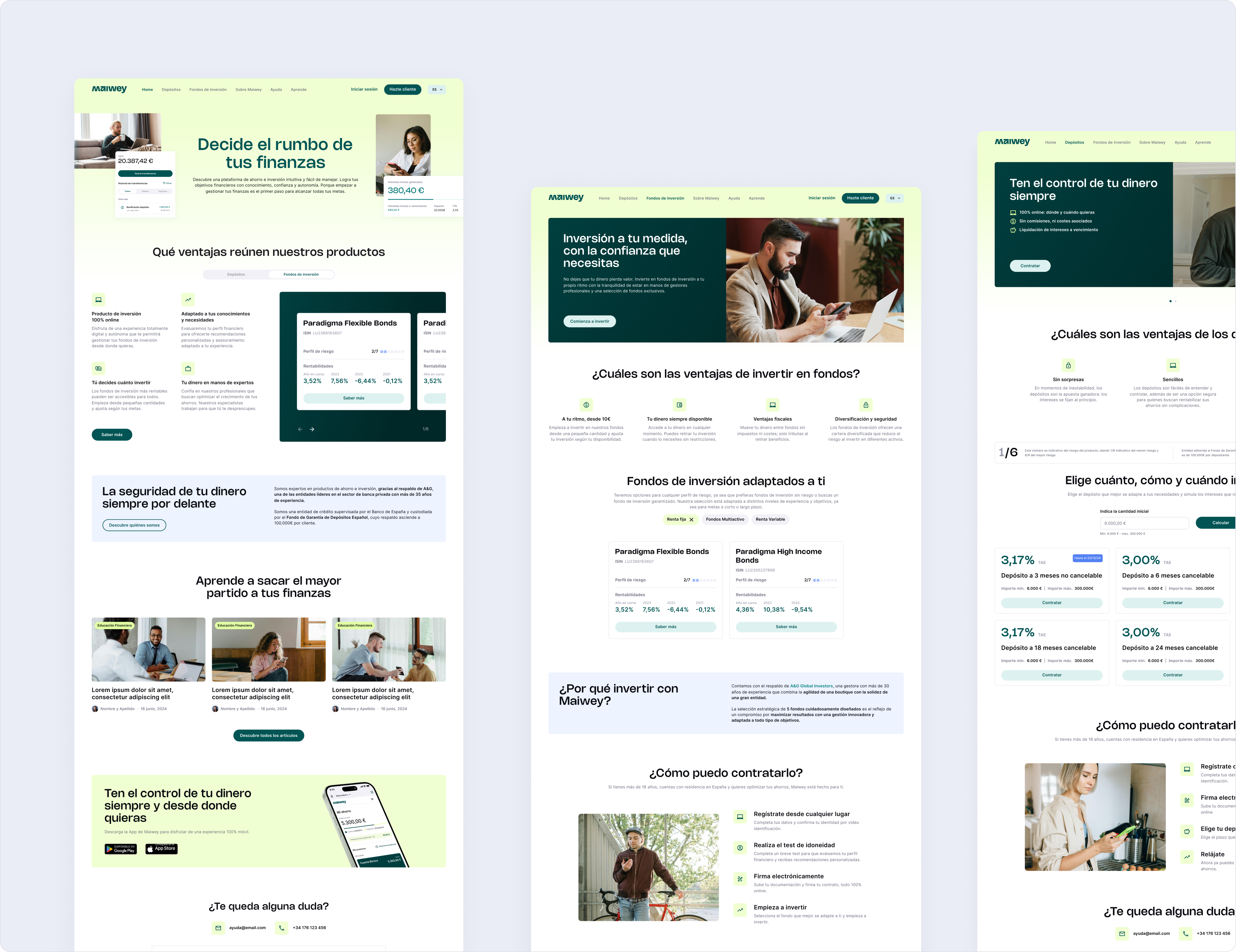
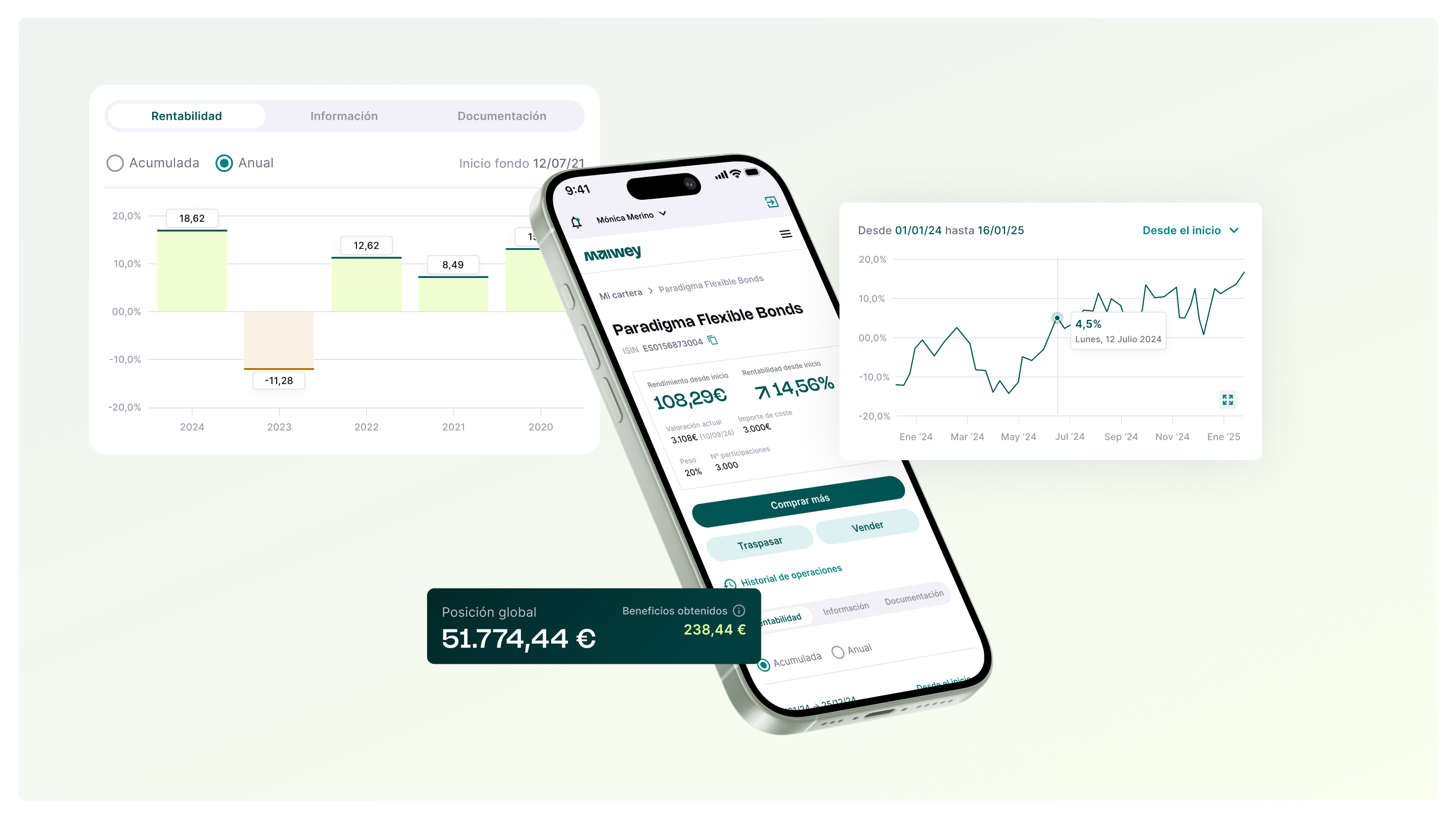
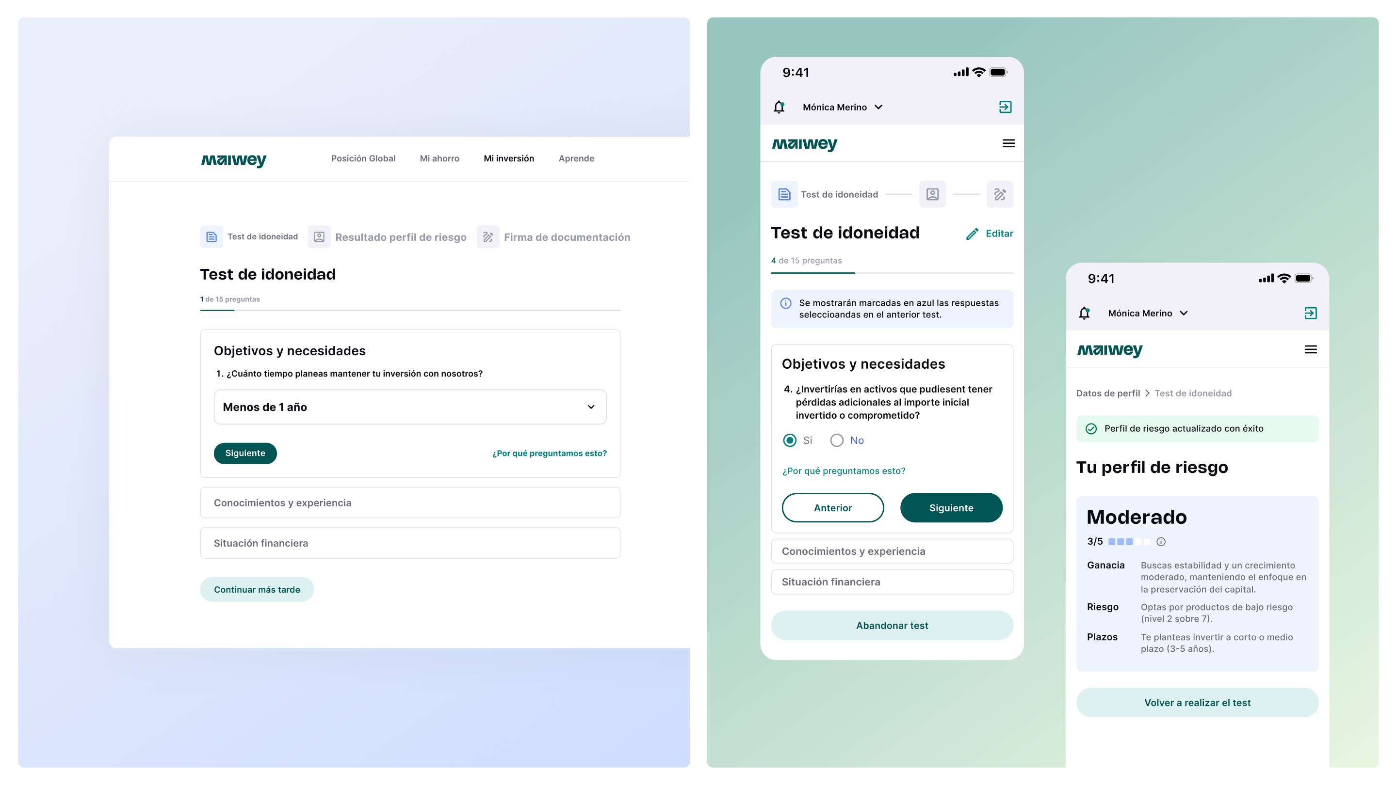
Testing showed users needed to compare across funds, not view them one at a time. I redesigned it as a multi-fund overview. A glance on any screen should answer "am I up or down?"
I adapted data density per breakpoint. Desktop shows the full chart with granular data points. Mobile keeps only the trend line and key numbers. Same data, different depth, because context changes with screen size.
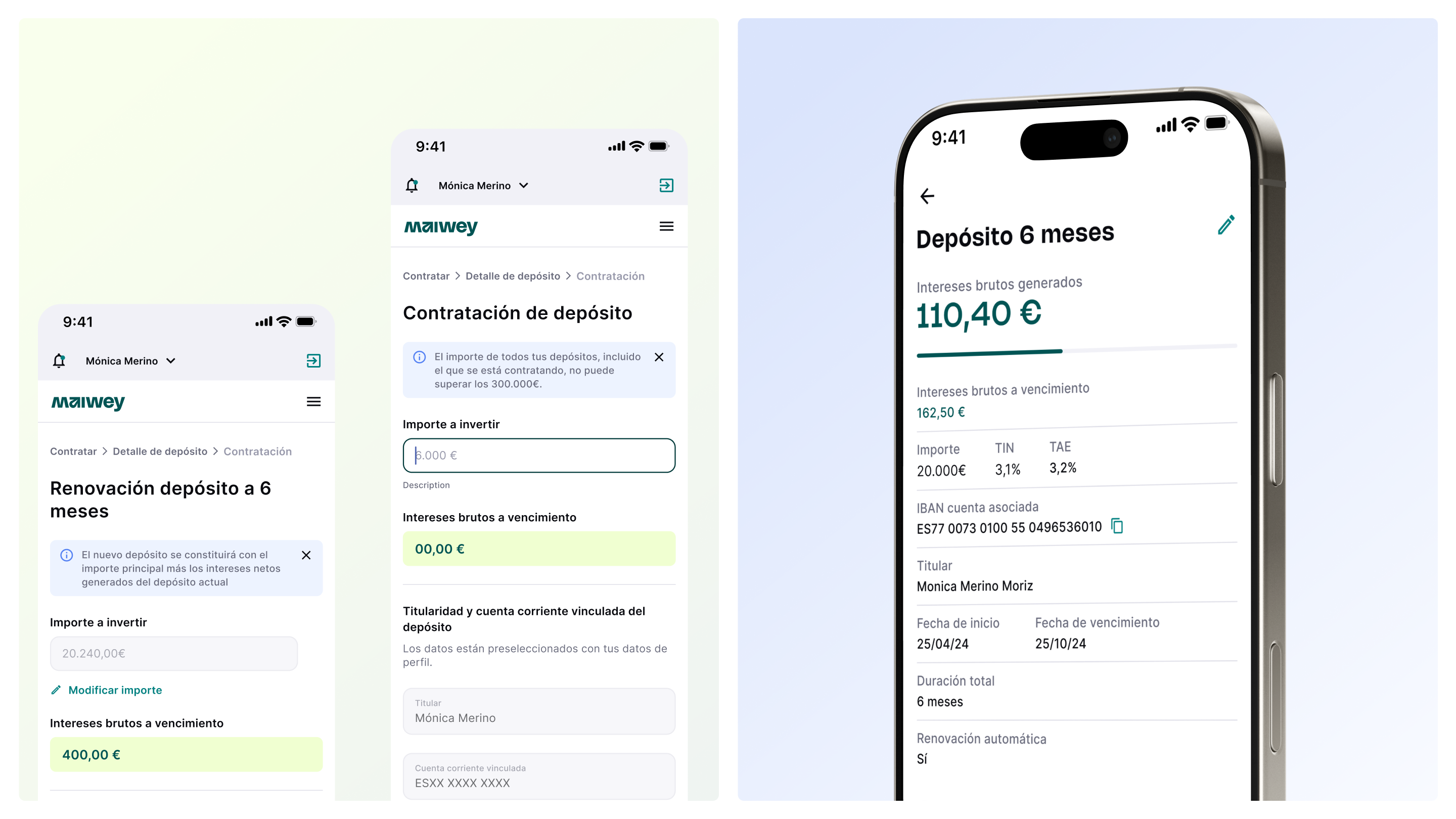
Most platforms bury this in a 30-field form. I broke it into three sections, one question at a time.
I added "why are we asking this?" to every question. Legal pushed back because they worried plain-language explanations might create liability. I sat with the compliance team and we wrote each explanation together, keeping it accurate but plain. Drop-off fell by a third.
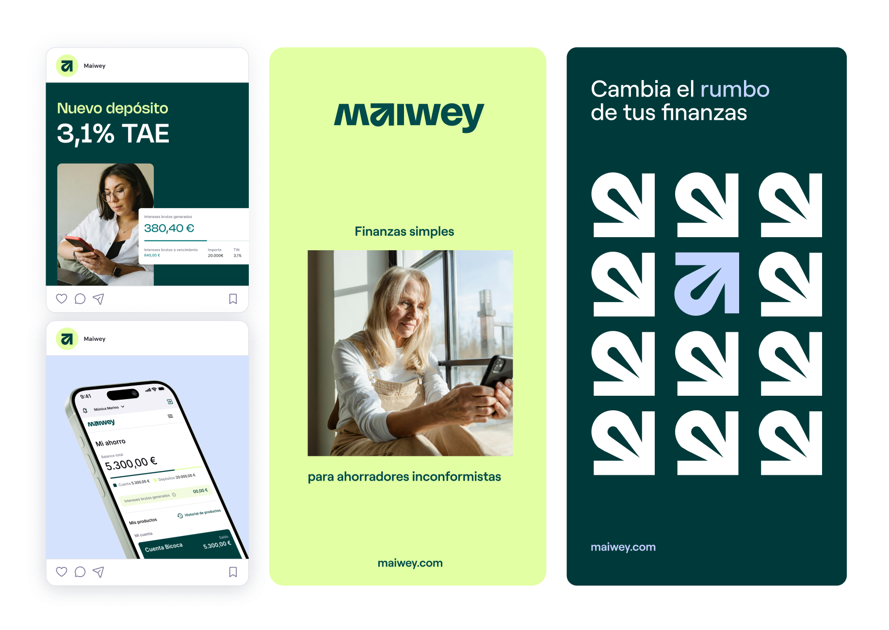
I modified the typeface Nohemi in three places: the "a" became an upward arrow, the "m" flipped into a "w", the "i" lost its dot. That arrow became the app icon, the favicon, and the one element users recognize at any size.
Build brand and product at the same time, not in sequence.
Every visual decision had to survive a 320px screen. I now test identity work at the smallest breakpoint before presenting it at full scale.
In fintech, clarity is the feature.
The suitability test taught me that explaining why you're asking is more effective than simplifying the question. I now write interface copy that justifies itself.