Apple's teams were exporting dashboards to slides just to share a number. I designed five core flows for the internal tool that replaced them.
Apple's Global Business Intelligence group needed an internal reporting product that felt native to Apple and passed internal accessibility review.
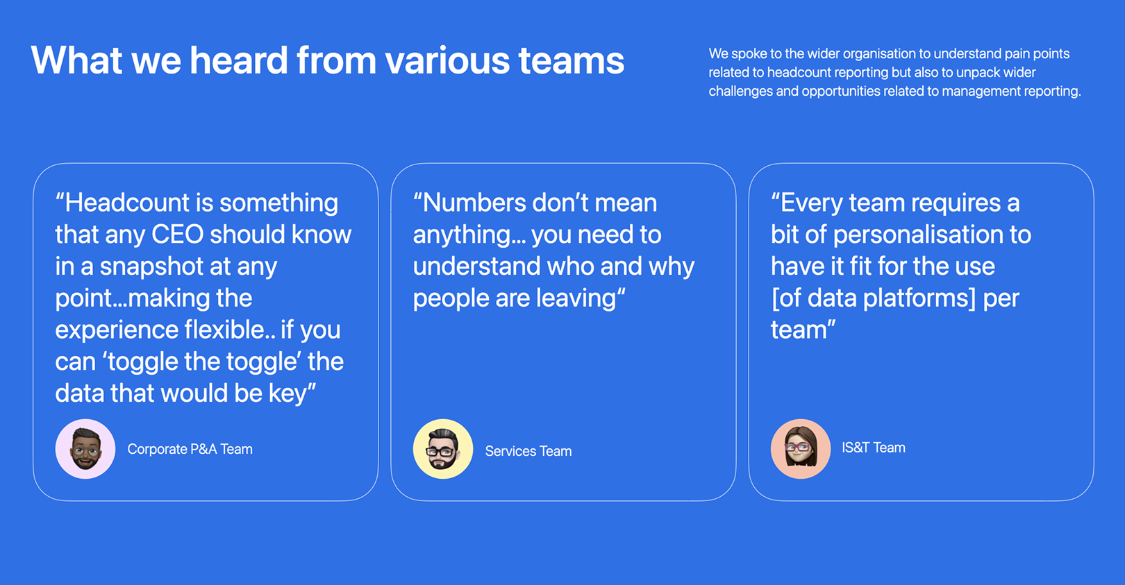
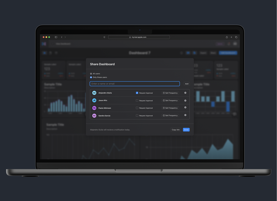
14 interviews across three teams. I expected dashboard creation to be the biggest pain. It wasn't. Every team described the same broken loop: export, paste into Keynote, email, wait, repeat. That finding moved Share from backlog to core scope.
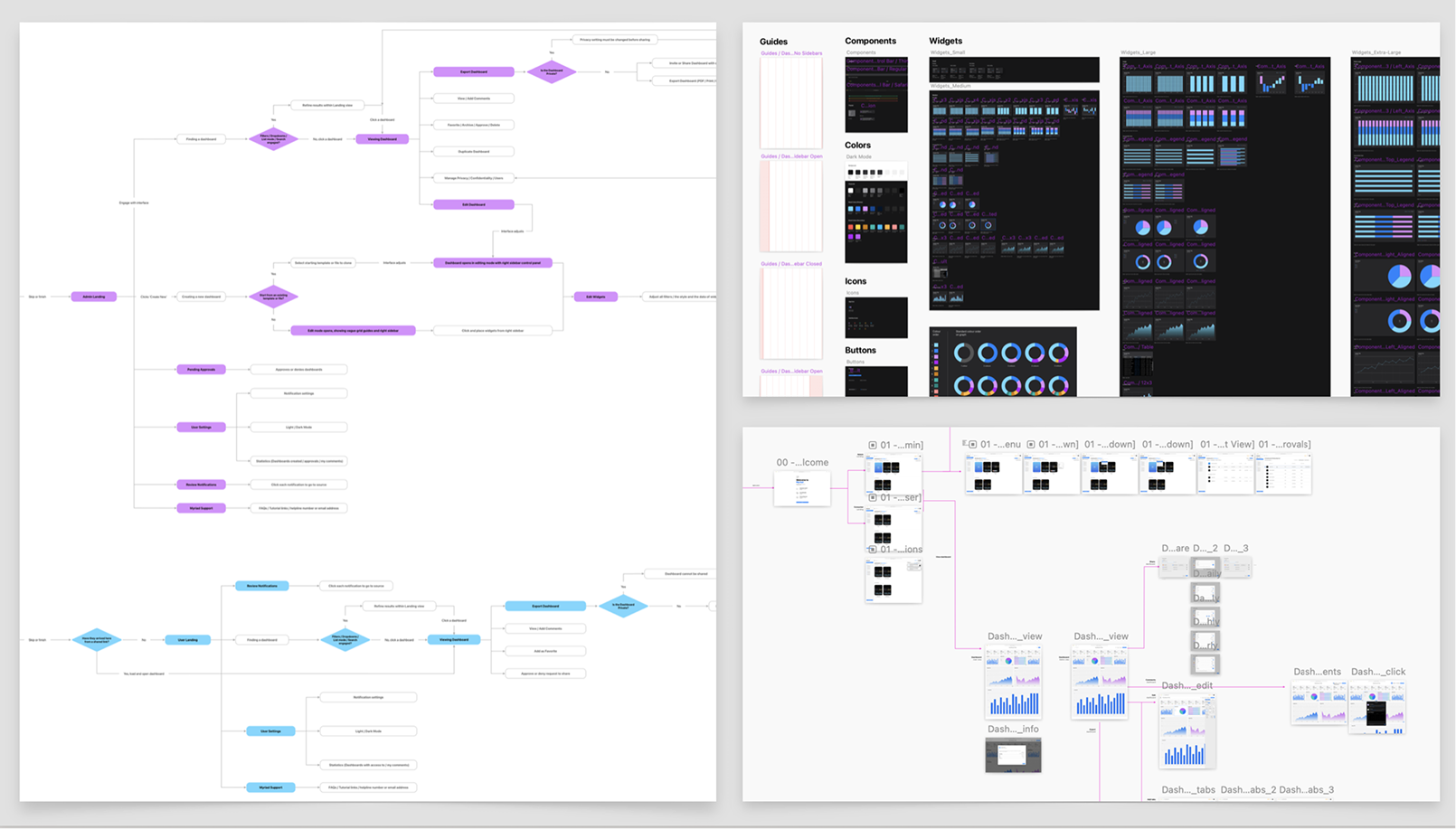
User flows mapped across Admin and Viewer roles
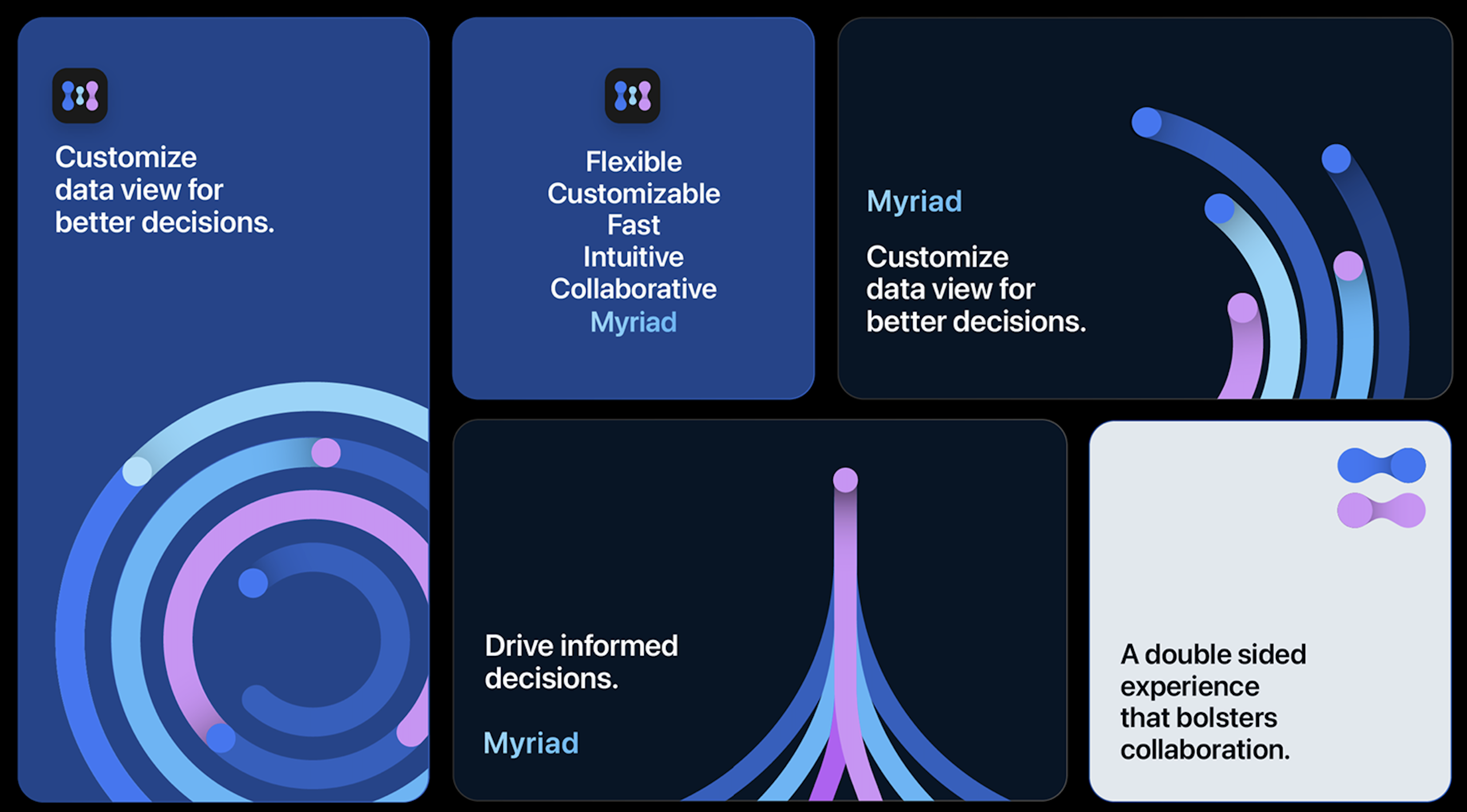
I co-led brand direction with another designer. Colours derived from iOS system colours so the product feels native, pressure-tested against WCAG 2.0. I built the accessibility matrix and designed core components of the 40+ piece library.
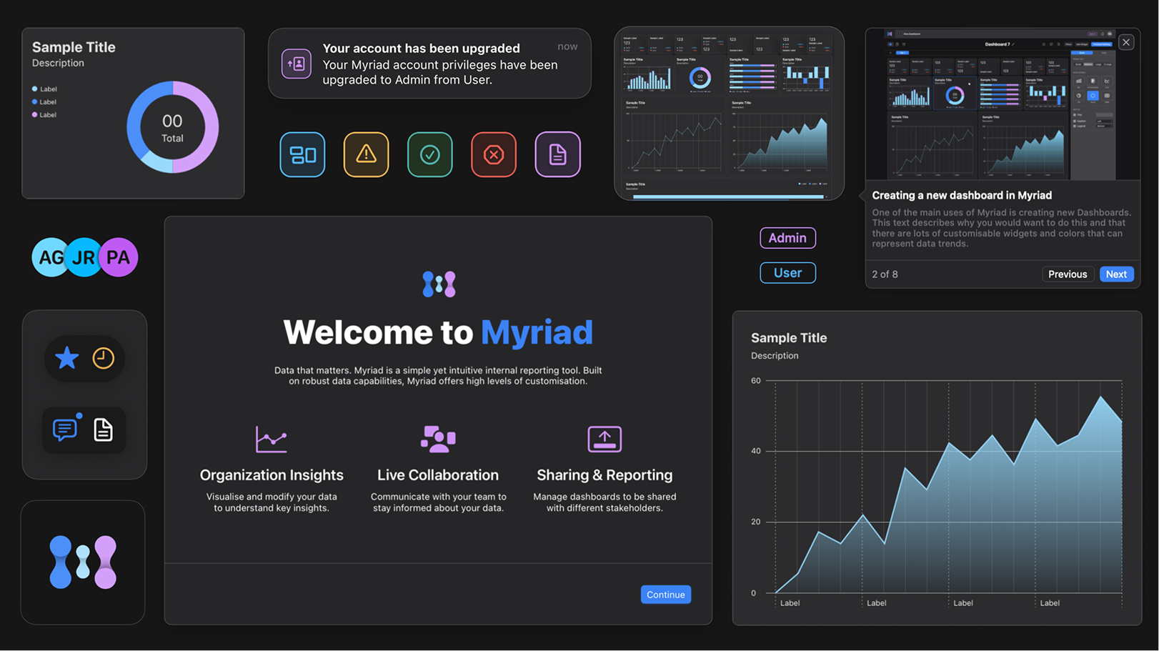
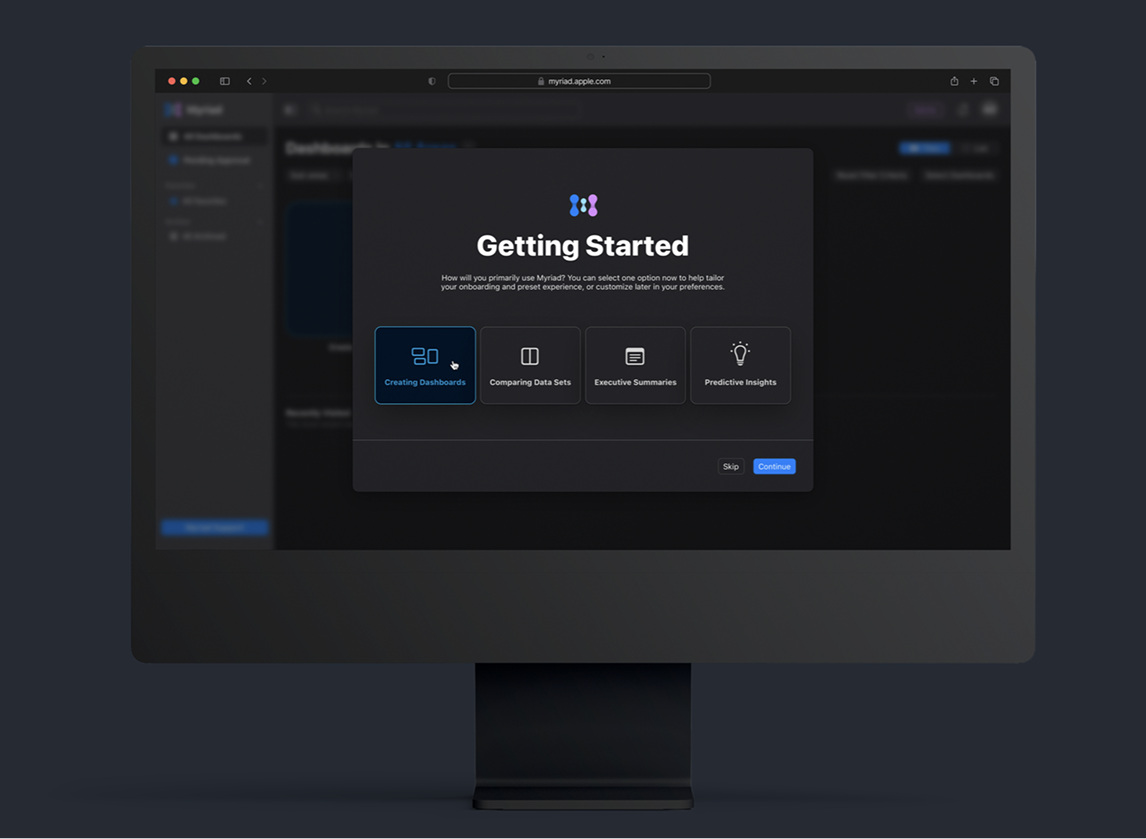
No onboarding existed. I tested a walkthrough and a tooltip tour, both failed. Landed on a self-selection model: one question, "How will you primarily use Myriad?" and the interface adapts.
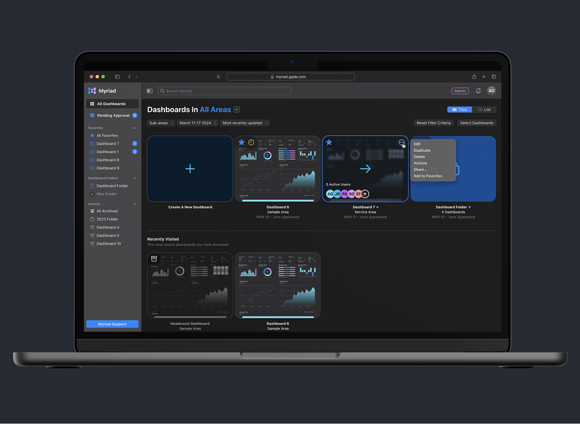
No folders, no search, no ownership info. I designed the landing as a central hub that felt clean for three dashboards but scaled for a power user managing thirty.
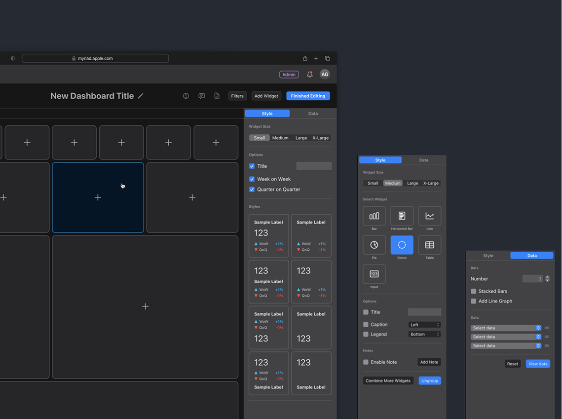
PM pushed for a full-screen modal. I prototyped both, tested with six users. Five preferred the sidebar with real-time preview. Four widget sizes (S, M, L, XL) over unlimited resizing. Fourteen teams needed consistency more than freedom.
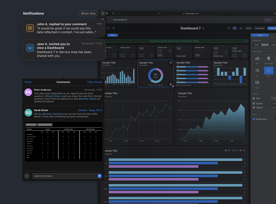
The workaround: screenshot a chart, paste into Slack, "does this look right?" I designed in-context commenting attached directly to widgets, with a slide-out panel that surfaces collaboration cues without competing with the data.
The flow research pushed to the top. I designed in-app sharing with per-person approval schedules and automated reminders. Teams stopped exporting to Keynote within two weeks.
Research should reorder your roadmap, not just validate it.
I assumed dashboard creation was the core problem. Sharing was. I now start every project by mapping the handoff and distribution layer before the creation layer.
Ship the constraint, not the flexibility.
Unlimited resizing would have felt powerful for one team and chaotic across fourteen. I now default to designing the tightest useful system first and loosening only when real usage demands it.